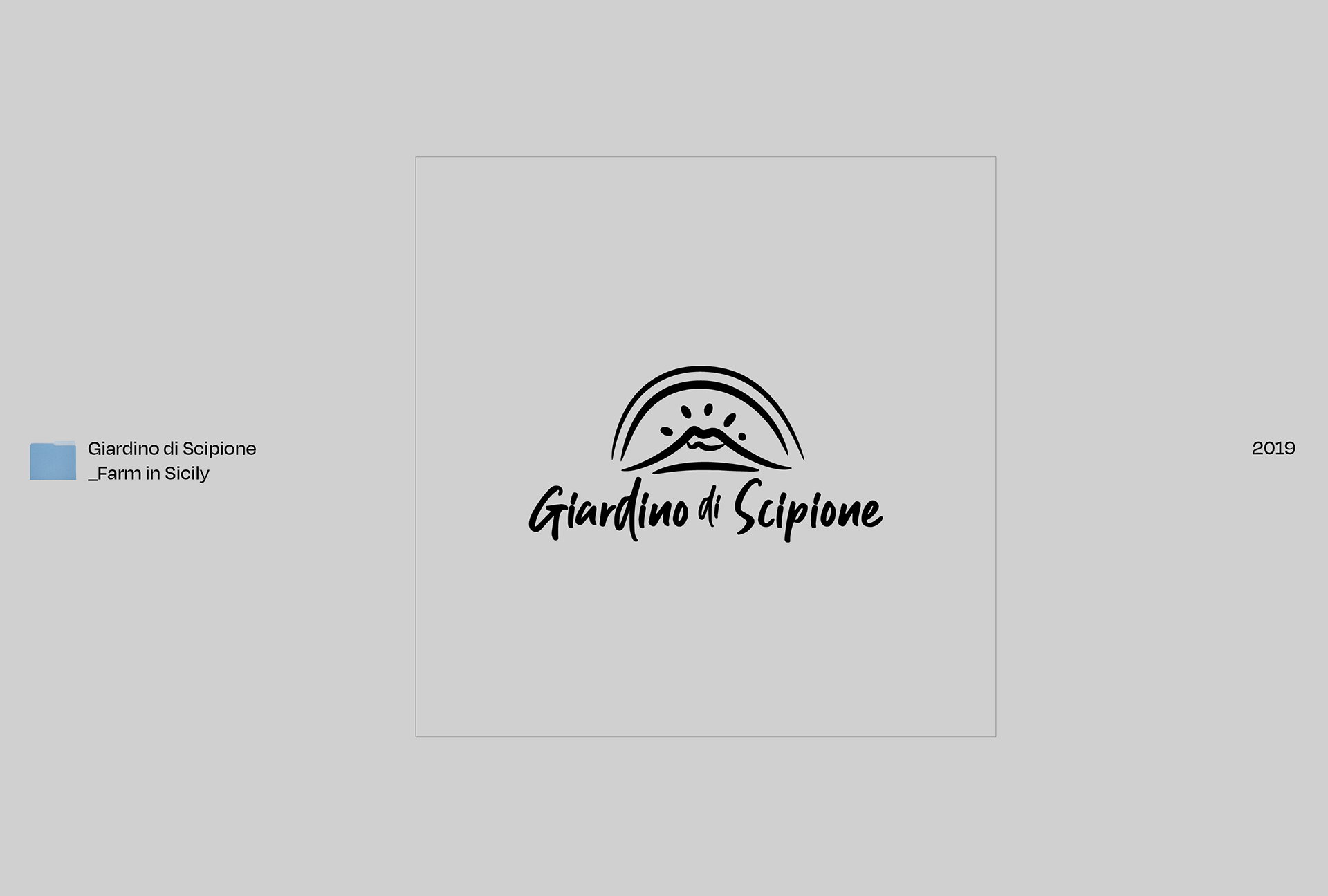
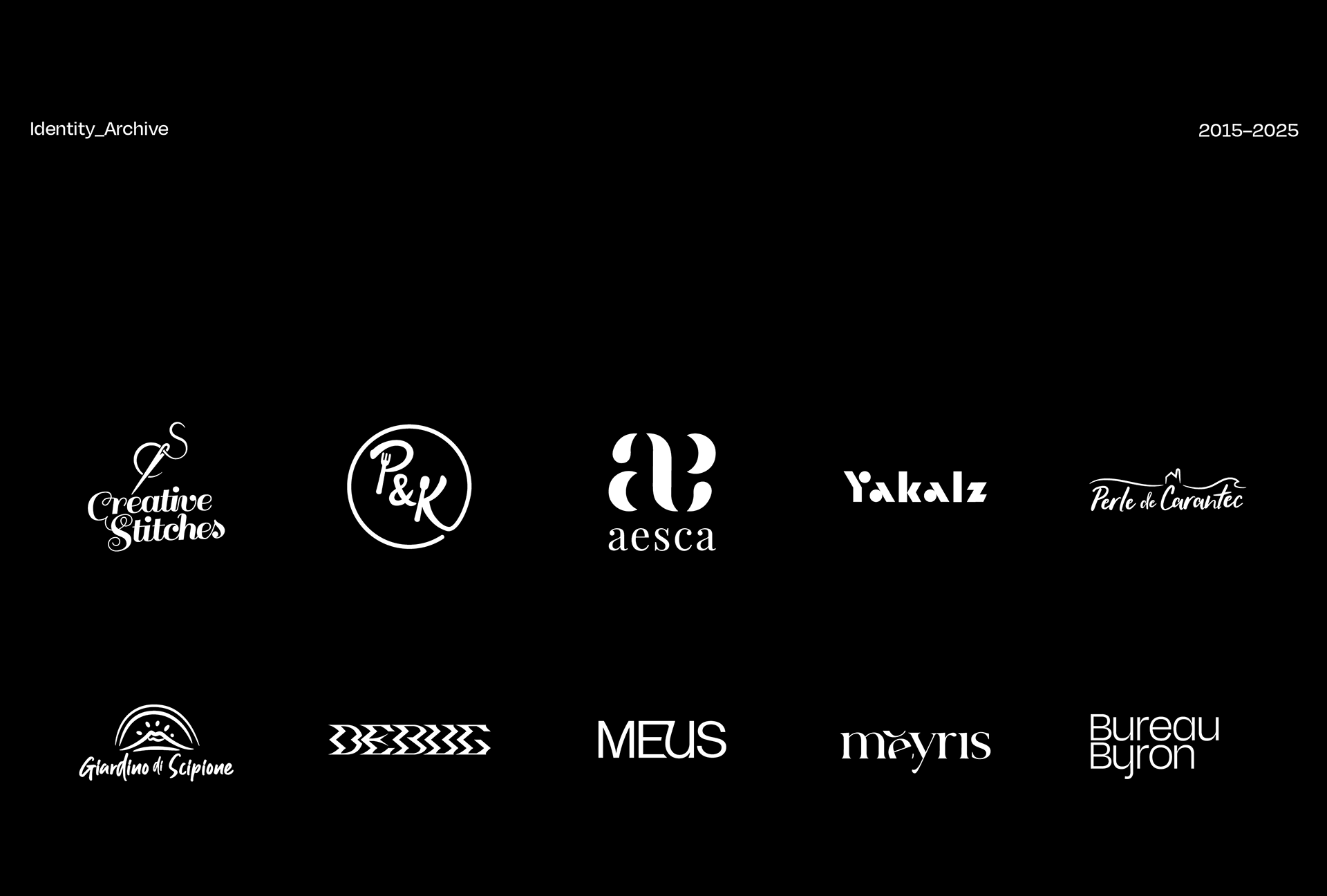
Over the past ten years, I’ve had the privilege of crafting visual identities for a spectrum of brands: emerging startups, cultural institutions, purpose-driven collectives, and exciting initiatives. Each logo is more than a mark; it’s the outcome of deep listening and an obsession with representation.
This case study brings together a curated selection of my logo work, highlighting not just aesthetics, but the strategic and emotional foundations behind each identity. From wordmarks to icons, each piece reveals a moment in time designed to be remembered, relevant, and rooted in meaning.

Credits
Design - Byron Co | Creative Director (Yakalz) - John Ed de Vera | Agency (Perle de Carantec/Giardino di Scipione) - PARIPARI GmbH | Design (Meyris) - Quyen Ta, Scott Bui